Change the Number of Columns in the Blog Module using the Fullwidth Layout
1. Open the Blog module’s settings by clicking on the Gear Icon
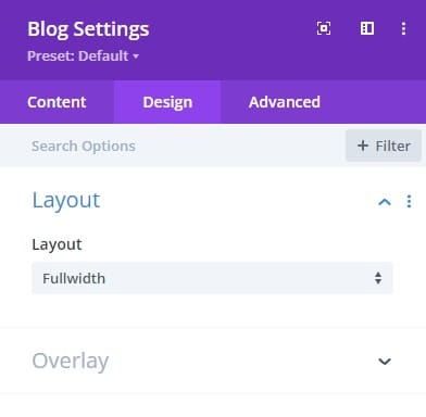
2. Go to Design Tab → Layout and choose Fullwidth
3. Go to Advanced Tab → Custom CSS → Free Form CSS
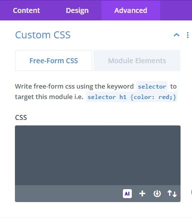
4. Copy/paste the following CSS code and then press Save
selector.et_pb_module {
–no-of-columns: 4;
–gutter: 20px;
–padding: 19px;
}
}
@media (min-width: 768px) and (max-width: 980px) {
selector.et_pb_module {
–no-of-columns: 3;
–gutter: 20px;
–padding: 19px;
}
}
@media (max-width: 767px) {
selector.et_pb_module {
–no-of-columns: 1;
–gutter: 20px;
–padding: 19px;
}
}
selector.et_pb_module .et_pb_ajax_pagination_container {
display: grid;
grid-template-columns: repeat(var(–no-of-columns), 1fr);
gap: var(–gutter);
}
selector.et_pb_module .et_pb_post {
margin-bottom: 0;
border: 1px solid #d8d8d8;
padding: var(–padding);
}
selector.et_pb_module .et_pb_post .entry-featured-image-url {
display: block;
margin: calc(-1 * var(–padding)) calc(-1 * var(–padding)) var(–padding) calc(-1 * var(–padding))
}
selector.et_pb_module .et_pb_ajax_pagination_container div:last-child {
grid-column: span var(–no-of-columns);
}