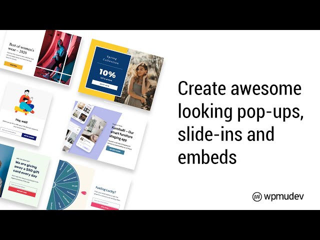
11.2 Creating Modules (Popups, Slide-Ins & Embeds)
New pop-up, slide-in and embed modules are created the same way and share many customization options. This section covers the shared features for the Popups, Slide-Ins & Embeds modules.
Effective Popups
Creating attention-grabbing popups is made incredibly easy with the features offered by Hustle. For a quick guide to making effective popups, read our blog on how to Make the Perfect Popup with Hustle.
To create a popup, slidein or embed, either click the Create button in the corresponding section of the Dashboard panel, or select the desired module in the Admin Menu and click the Create button.

You can also create a new module, or duplicate the one you’re currently editing, from within the editor for any module.
To duplicate the module you’re currently viewing in the editor, click the gear icon and select the Duplicate option. (Note that the “View Email List” option appears here only if your module is an Opt-in, and the “Copy Shortcode” option only appears if it’s an Embed module.)

To Create a new module of the same type from within the editor, click the [+] icon.

Choose Content Type
In the modal window that pops open, select whether your content should contain an email opt-in form, or be informational content instead.
- Email Opt-in – This option creates a module which includes email collection functionality and integrations with 3rd-party apps. Select this option if you want to collect and save user email addresses to a local list and/or one or more 3rd-party apps.
- Informational – No email collection functionality or integrations with 3rd-party apps. Select this option if you want to create a promotional module with no email collection needed.
An Informational module has the same set of options as an Email Opt-In module, which has a few additional ones pertaining to email collection & 3rd-party apps.
Hustle Those Subscribers
Looking to expand your current email subscribers? Check out our blog on How to Get the Most Email Subscribers Using Hustle to dive into all the little tips and tricks.

11.2.1 Choosing a Template
Our template options make it incredibly easy to publish high-quality marketing content on your site.
Once you have chosen your content type and given your module a name, click Choose Template. Depending on whether you have selected an Email Opt-in or an Informational module, there will be different templates available to you. Currently, the following templates are available to choose from:
- New Year
- Christmas
- Happy Holidays
- Minimalist
- Spring Sale
- Stay – Exit Intent
- Foodie
- Tech
- Black Friday
- Newsletter Signup
- Spin the Wheel
- Give Away
- Pandemic
- Chinese New Year
- Valentine’s Day
- Summer Holiday 1
- Summer Holiday 2
- Halloween
Hover your mouse over any of the available templates and click the Preview button to see how it would look on your homepage. You can also choose the Start from scratch option to create a completely unique design for your module.

11.2.2 Content
The Content section is where you add the various elements you want to appear in your module, and the text you apply to those elements.
Title
Optionally enter the title and subtitle that you want to appear in your module here.

Images
Optionally add a featured image and/or background image to be displayed in your module. Use the image uploader to add images. Research indicates modules containing featured images have a much higher conversion rate than those without.

Main Content
This is where you’ll enter the body of the message you wish to display to users in your module.

Call to Action
Choose whether you want to include one or two call-to-action buttons, or none at all. For each CTA button, you can customize the button label and select from the following options:
- Redirect – New window
- Redirect – Same window
- Close Popup/Slide-In (does not appear for Embeds)
If you select a redirect option, you can specify either a full URL, or the CSS ID of an element on the same or different page. For example, you could redirect in a new window to the cookies declaration section of your privacy policy page: https://example.com/privacy-policy/#cookies

And, If you choose to include only one CTA button, you can also make the entire module a clickable CTA.

Helper Text
Optionally enter some helper text that will appear beneath the CTA buttons.

Never See This Again Link
When enabled, this option adds a link at the bottom of your module that, when clicked, adds a cookie inc_optin_never_see_again-popup-x (x is the ID of the pop-up) to the user’s browser. As long as that cookie exists in that browser, the module will not be shown to that user when using that same browser.

With all content options enabled, your opt-in module could look like this example:

11.2.3 Emails
Email opt-in modules include a basic form to collect user information. Use the email options to customize the form’s fields and submission behavior and to configure a confirmation email if one is desired.
Need more fields?
If you need more form fields in your module than those available in Hustle, you can create an Informational module instead of an opt-in, and embed a Forminator form in it.
Opt-in Form Fields
You can customize the email opt-in form by adding, removing and editing the form’s fields. By default, First Name, Last Name & Your Email fields are already included, but you can delete or edit them if needed. Click Insert Field to add a field(s) to the form.

Select the fields you want to add to the form. Multiple fields can be selected and inserted at the same time. The available fields include:
- Name
- Phone
- Address
- Website
- Text
- Number
- Datepicker
- Timepicker
- reCaptcha
- GDPR Approval
- Hidden Field

Click Insert Fields to insert the fields.
To edit a field’s options, click on the field itself or click the edit icon (gear) to open a drop-down menu and then click the Edit Field option.
The Edit Field modal organizes customization options under three tabs: Labels, Settings and Styling.
Labels tab
- Label – This is what appears as the field label.
- Name – This is the field name used internally for form submission. If you edit this, be sure it contains no spaces to ensure successful form submission.
- Placeholder (optional) – Enter optional placeholder text that appears in the field until the user starts entering their own text.

Settings tab
Depending on the module, the Settings tab will offer one or both of the following options:
- Optional/Required – When adding a new field, or editing an existing one, you can specify whether or not the field is Required in the Settings tab. When you select Required, an additional field will open so you can enter an error message that the user will see if they leave the field blank or incomplete. Each required field will have an asterisk ( * ) in the form to alert your user that the field must be answered.
- Validate Field – With validation enabled, Hustle will check email addresses, time data, website URLs and dates to verify that the submitted data is in a valid format. Enabling this will let you enter a custom message users will see if the data is invalid.

Styling tab
- Additional CSS Classes – You can set the Additional CSS Classes in the Styling tab in the field settings.
Here you can add a class to the field so you can add custom CSS (to add multiple classes, use a space to separate). This will help you, for example, separate one field from the others by adding some padding to it or to color a text of a certain field.

Capturing URL Query Parameters
If you need to capture query parameters from the URL of the page where your module loads, you can do that using a Hidden field.
When editing your Hidden field, select Query Parameter as the Default Value and enter the name of the query parameter you want to capture as the Query parameter.
For example, if you want to capture the value of a parameter called test_one from the following page URL, you’d enter that in the Query parameter field:
https://example.com/?test_one=this_is_the_value

Submission Behavior
Use the Submission Behavior options to determine what happens when an opt-in module is successfully submitted. You can choose to display a success message to the user, or redirect them to a different URL after submission.
Success Message
Create a custom Message that users will see when the form is successfully submitted.
Optionally set the amount of time that should pass before the message should Auto close.
If you want a file to be automatically downloaded to the user’s device when they submit your opt-in, toggle on Enable auto downloadable file after submission and select the file.

Redirect
Enter the Redirect URL for the page you want users to be redirected to following a successful submission. The URL can include email opt-in form data, which can be helpful if you need to redirect users to different pages depending on a selected option in your opt-in form. To add a form field’s data to the Redirect URL, click the [+] icon and select the desired form field.
Then select the Redirection Option that best suits your needs:
- Redirect on the same tab
- Redirect on new tab and show thank you message on page
- Redirect on new tab and hide module on page

Automated Email
Enable this feature to automatically send an email to users following a successful submission.
Email Time
- Instant – Sends the email as soon as the form is submitted.
- Delay – You can specify a delay of any number of seconds, minutes, hours or days before the email is sent.
- Schedule – You can set a specific date and time to send the email or, if you’re Date and Time pickers in your opt-in form, you can use those fields to trigger the email based on user input. You can also optionally delay the email here as well.

Recipient, Subject & Body
Click the [+] icon in the Recipient field to select the email field from your form and automatically add the email address entered by the user. If needed, you can add as many other email recipients as you like as a comma separated list.
Click the [+] icon in the Subject field, or the Hustle icon in the Email Body to use values from your opt-in form and personalize the emails.

Note that if you include the Unsubscribe Link in the email body (it looks like this: {hustle_unsubscribe_link}), you’ll want to be sure to include the required unsubscribe shortcode on a page on your site. Then, when users click on the unsubscribe link in an email, they will be redirected to your unsubscribe page.
11.2.4 Integrations (Modules)
Connect your apps first
Hustle supports the integration of several apps into your modules, allowing you to share submission data with third-party services. Before apps can be integrated into a specific module, however, they must be connected to Hustle. Each app connects in a unique way, so we’ve created a separate Integrations section with unique guidance for each app, which you will find here, Integrations.
11.2.5 Appearance (Modules)
The elements contained in each module are created in the Contents tab, and the Appearance tab is where those elements are given their custom design. The key to a good design is to add the elements you want in the Content section first, then customize the module’s design.
Mobile Settings
The mobile settings feature allows you to customize your module’s appearance for mobile devices. To enable this feature, click on the Custom Mobile Settings toggle and navigate to the mobile tab.

Note: The Layout, Color Palette, Font Family and Typography, Vanilla Theme, and Custom CSS settings for the mobile view are inherited from the Desktop settings. While majority of these settings can be altered, the Layout and Color settings cannot be changed for the custom mobile settings.
Choose Layout
Use the layout feature to decide how you want the module’s elements positioned relative to one another. Try different layouts and use the Preview feature to see which one works best. The preview feature allows you to choose between a Desktop or a Mobile view so that you can be extra sure that your layout will look perfect, no matter what device your visitors are using.

For example, the images below of are of the same module with the only difference being the selected layout.


Customize Elements
Adjust your elements to suit your preferred appearance.
Featured Image
Use the feature image controls to adjust the position of the feature image with the layout. Remember, the selected layout determines the feature image’s default position. The feature image controls allow you to make subtle changes in the way the image appears.
- Alignment – Choose whether you want your image to appear to the left, right, above or below the content in your module.

- Size – Select a predefined size in terms of percentage or set a custom size according to pixels.

- Fitting & Position – Customize how you want the image to fit in its container. The Cover and Contain options can be further tweaked with the Horizontal and Vertical positioning settings.

Background Image
Customize your background image with the following settings:
- Background Size – You can choose your size setting to be Auto, Contain, Cover or Custom, which allows you to manually input a width and height.

- Position – The alignment of your image can be adjusted to be left, right or center aligned. Alternatively, you can set the horizontal and vertical values to create a custom position.

- Background Repeat – Decide if you want your background image to be repeated to create a pattern of the same image. This can be repeated both vertically and horizontally with the repeat mode. You can also choose repeat-x, repeat-y or none.

Call to Action
This setting allows you to choose the alignment of your Call to Action button. The options are:
- Left – Aligns to the left.
- Center – Places the button in the center.
- Right – Aligns to the right.
- Stretch – Places the button in the center but elongates the button size to fill the space horizontally.

Opt-in Form
The Opt-in Form settings allow you to change the layout and spacing details of your opt-in form.
- Form Layout – Form positioning can either be inline or stacked.

- Form Fields – Adjust your field icon animation settings and field proximity.

Close Icon
The Close icon settings enable you to select whether the icon should display Inside the module, Outside it, or be Hidden.
If you select either Inside or Outside, you can also choose the icon Alignment, Style, and Size.
Typography
By default, your module inherits font styles from your theme. To leave the fonts as is, select Default. However, the typography settings enable you to use Bunny Fonts to customize your font style. This can be done by selecting Custom.
Bunny Fonts Replaces Google Fonts
We have replaced Google Fonts with Bunny Fonts for GDPR compliance. So if you are using a firewall at your webhost, you may need to allowlist http://fonts.bunny.net/ to prevent any issues.
To apply a new font-family to all your elements, select a font from the Font Family drop-down menu and click Apply. You can also apply a custom font by selecting Custom user font in the Font Family menu and typing your font into the Custom Font Family region.

Font Styles
The font styles of individual elements can also be customized.
General
Target the General tab to change the following elements:
- Title
- Subtitle
- Main Content
- Call to Action – Button
- Call to Action – Helper Text
- “Never see this again” Link

For each element, you can adjust both Basic and Advanced settings:
- Basic – Choose the font family, custom font family, font size, font weight and change the alignment.
- Advanced – Use this to customize the line height and the letter spacing. You can also set the text transform to control capitalization, as well as the text decoration to add underlines, overlines and strikethroughs.
Opt-in
Adjust your font style in the Opt-in tab to change elements including:
- Form – Input and Select
- Form – Submit Button
- Error Message
- Success Message

Each of these elements can be customized with the same Basic and Advanced settings for the General tab where relevant to the element. Don’t like your changes? Click the Reset button to revert back to your original settings.
Colors
Use the Color Palette drop-down menu to choose from one of six pre-defined color schemes, or modify that default scheme if you wish to create your own custom palette.

Below are examples of how the default color schemes make varying the appearance of your modules quite easy. These are the same module, each with a different default color scheme applied.


Alternatively, you can fully customize the colors yourself.
General
The elements that you can customize under the General tab are as follows:
- Pop-up Container – Edit the overlay color for the area surrounding the main content of your pop-up modules.
- Main Layout – Customize the border, background and box shadow colors of the main area.
- Layout Content – Select different colors for the border and background of your main content area, which includes your feature image.
- Layout Footer – This footer section is visible when the Call To Action is enabled.
- Feature Image – Change the background color of the featured image.

- Content Wrapper – Edit the area around your content by changing the border and background colors.
- Title – Edit the font, border, background and box shadow color for your module title.
- Subtitle – You can customize the font, border, background and box shadow color for this block.
- Main Content – Adjust the border, font, ordered list counter, unordered list bullets and blockquote border of the immediate main content section.
- Call to Action – Container – Change the color of your CTA border color.
- Call to Action – Button – Customize the label, border, background and box shadow colors for the default design plus the hover and focus designs.
- Close Button – You can adjust the close icon color with this setting.
- “Never see this again” Link – Personalize the color used for the font of this message.

All of the colors in these elements can be fully customized by using the color picker or by typing in a hex color code.
Opt-in
Much like the General tab, you can create the perfect color scheme for yourself by adjusting the elements individually in the Opt-in tab. The elements that can be adjusted are:
- Form Container – Add your own colors for the border and background of your form container.
- Inputs – Select the icon, placeholder, font, border, background and box shadow color. These can be chosen for the default, hover, focus and error actions.
- Submit Button – Edit the border, background, box shadow and font color for the default, hover and active cases.
- Error Message – Customize the border, background and message color for your error message.
- Success Message – Personalize the color for the border, background, box shadow, success icon and content.

Made a mistake? No problem, just click the Reset button to revert the colors back to their default values.
Advanced
With the advanced customization tools, you can really hone in on perfecting the look of your modules.
Border, Spacing and Shadow
The default settings in this section suit most designs perfectly but if you want to personalize your elements even more, you can do so by adjusting the settings for your General and Opt-in elements. The adjustable elements are the same as mentioned above in the Colors section, except for Layout Footer and Feature Image.
For each element, you will be able to customize up to five different aspects of your design. These aspects are:
- Margin – Add margins either above or below, as well as to the left or right of the element.
- Padding – Create padding around each side of the element.
- Border – Adjust the weight of the border and select the type of border.

- Border Radius – Individually change the border radius for each corner.
- Box Shadow – Customize the X and Y-offset values, as well as the blur and spread of the shadow.

Note: When the link icon is enabled, all of the fields for the one aspect will sync and all equal the same value. For example, if you know that you want 10px padding on all sides of your element, you can input 10px in the first field, click the link icon and the remaining three fields will automatically be set to the same setting of 10px. To disable the link feature, click on the broken link icon.
If you want to remove all of your changes, you can click the Reset button.
Pop-up Size
Choose to use the default pop-up size or customize both the width and height to achieve a unique size.

Vanilla Theme
The Vanilla theme is useful when using custom CSS to design your module yourself. It does not affect the module’s contents or the selected layout. However, enabling this option does disable the following design options:
- Typography
- Colors
- Border, Spacing and Shadow
- Pop-up size
Note that the Vanilla option here inherits your theme’s CSS. So if your theme happens to have CSS selectors that match any of the Hustle module’s elements, the module will inherit that CSS and you may need to override things in your own custom CSS below.

This image below shows what the Vanilla option looks like with no CSS from the active theme interfering. Note that the module background will be transparent so if you don’t set a background color or image for your module in your custom CSS, your page content will show through.

Custom CSS
You can design a custom modal to display your module’s contents using CSS. This can be activated by clicking on the Enable custom CSS toggle and by using the selector buttons provided to quickly design a custom module.

11.2.6 Display Options (Embeds Only)
The Embed module has some additional display options allowing to select how your embedded module should appear in your posts & pages.
- Inline Content – Select either Below, Above or Both to automatically add your embedded content at the specified position in your posts & pages.
- Widget – Enabling this option makes a Hustle widget available under Appearance > Widgets so you can add any embed to any widgetized area of your theme.
- Shortcode – Creates a shortcode you can use to add your embed anywhere shortcodes are accepted.

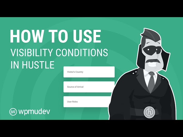
11.2.7 Visibility (Modules)
By far, the chief complaint about pop-ups it’s that they appear too often to people who have no use for them. Ensuring that marketing messages are as precisely targeted as possible will greatly improve conversion rates while also minimizing the potential annoyance to uninterested users. Hustle allows you to choose where and under what conditions your module will appear by applying conditional visibility rules. More on this can be found in the video below.
Hustle uses conditional logic rules that, strategically configured, will ensure your module only appears to users you want to see it without interfering with the experience of users for which the module has no value. Remember, in the absence of a rule preventing it, all modules will appear on every post and page of your site. If you have more than one active pop-up, you can see how that might get real old, real fast for returning users.
For example, a visibility rule can dictate that a module should only appear to logged-in users, or conversely, that it should appear only to users who are not logged in. A more complex example would be a rule that displays the module to users who are not logged in and who accessed a specific page or post directly from a search engine or even more interestingly, from a specific URL.
Naturally, Hustle supports conditional rules that dictate on which pages and posts a module will display, but it also provides several additional conditions that can be used to refine basic page/post rules.
We recommend that you take the time to carefully consider where and when you wish a module to appear before configuring visibility rules.
Visibility Condition Groups
You can create multiple condition groups, each with their own set of rules. Each condition group can be set to Show or Hide the module if Any or All of the conditions in the group are met.
To add a new condition group, click the Add Condition Group button. The Embed module also allows you to choose on which of its Display Options the condition group should apply.

As an example, let’s say you have a module you want to show on a specific page of your site to users with the Author role who login with their mobile device, and also show that same module to site visitors on a different page regardless of the device used.
You would set up 2 Condition Groups with the following Visibility rules:
Condition Group 1:
- Logged in status – Logged-In
- Visitor’s Device – Mobile Only
- Pages – Only these pages: Logged-In-Page
- User Roles – Only These: Author
Condition Group 2:
- Logged in status – Logged-Out
- Pages – Only these pages: Logged-Out-Page

Note that all rules you create will apply, so you’ll want to be careful to not create conflicting rule groups to avoid any unwanted display behavior.
Visibility Conditions
To add a visibility condition to a group, click the Add Conditions button in that group.
Each of the conditions below can be configured to authorize or prevent a module from displaying. Click on any one to jump to that condition’s usage instructions. Note that if you have any custom post types in use on your site, Hustle will recognize them and visibility conditions will be available for them as well.
General
- Posts
- Pages
- Categories
- Tags
- Archive Pages
- Static Pages
- User Roles
- Page Templates
- Visitor’s Device
- Visitor’s Browser
- Logged-In Status
- Visitor’s Country
- Source of Arrival
- Referrer
- Specific URL
- After Registration
- Number of times visitor has seen
- Visitor Commented Before
- Browser Cookie
WooCommerce
These conditions are only available if WooCommerce is active on the site.
- All WooCommerce Pages
- Products
- WooCommerce Categories
- WooCommerce Tags
- WooCommerce Archives
- WooCommerce Static Pages

Posts
- Select All Posts Except to have your module show on all posts, except the ones you specify in the list below.
- Select Only These Posts to have your module appear only on the selected posts.
Then just start typing in the post list field to bring up a list of posts matching the entered search text, and add the one(s) you want to apply to this condition.

Pages
Configuration of this condition is identical to that of the Posts condition above, except you’ll select the pages this condition should apply to.

Categories
Configuration of this condition is identical to that of the Posts condition above, except you’ll select the post categories this condition should apply to.
Note that this condition only applies to single posts belonging to the selected categories; it does not apply to category archives.

Tags
Configuration of this condition is identical to that of the Posts condition above, except you’ll select the post tags this condition should apply to.
Note that this condition only applies to single posts with the selected tags; it does not apply to tag archives.

Archive Pages
Configuration of this condition is identical to that of the Posts condition above, except you’ll select the archive pages this condition should apply to.
Note that you can only specify the type of archives pages this condition should apply to. If you need to specify individual archive pages for specific post categories, tags, etc, use the Specific URL condition below.

Static Pages
Configuration of this condition is identical to that of the Posts condition above, except you’ll select the static pages, like search results, this condition should apply to.

User Roles
Configuration of this condition is identical to that of the Posts condition above, except you’ll select the user roles this condition should apply to.

Page Templates
Configuration of this condition is identical to that of the Posts condition above, except you’ll select the page templates from your theme this condition should apply to (any custom templates you may have added to your theme will also be available here).

Visitor’s Device
Select Mobile Only to have your module show only on mobile & tablet devices. Select Desktop Only to have your module appear only on the desktop computers.

Visitor’s Browser
Configuration of this condition is identical to that of the Posts condition above, except you’ll select the browsers this condition should apply to.

Logged-In Status
Select whether your module should show only for logged-in users, or only for logged-out users.

Visitor’s Country
Configuration of this condition is identical to that of the Posts condition above, except you’ll select the visitor countries this condition should apply to.

Please note that this Visibility condition leverages MaxMind‘s rate-limited GeoLite database by default, and you should be aware of the following limits imposed.
- Greater than 120 API requests per minute will get you blacklisted for 1 hour, during which time you will receive a “429 Too Many Requests” response.
- More than 1500 requests per minute will get you blocked permanently at the firewall meaning the server will not reply at all.
You can switch to the alternate hostip.info geolocation service if you prefer. However, this service may not be 100% reliable as it uses its own internal database. If it does not recognize an IP address, the visibility condition might do nothing at all.
To switch to this alternate service, add the following code to your active child-theme’s functions.php file, or a mu-plugin:
add_filter( ‘hustle_geo_type_service’, function( $type ) {
return ‘hostip’;
} );
Source of Arrival
- Direct – Select this option to show your module to users who manually enter the page URL in their browser’s address bar.
- An external page – Select this to show your module to users who click through to your page from some other site.
- An internal page – Select this to show your module to users who click through to your page from another page on your site.
- A search engine – Select this to show your module to users who arrive at your page from a search engine results page.
- Not a search engine – Select this to show the module to users who do not arrive from a search engine results page.

Referrer
- Select Specific referrer to show your module to users who arrive on your page from specific sources (referrer URLs).
- Select Not specific referrer to show your module to users who arrive on your page from anywhere except specific sources (referrer URLs).
In both cases, you can use wildcards to match multiple URLs and/or referral strings if you’re tracking conversions from specific ad campaigns for example.
So you could use https://site.com/?referral=xxx as the URL, or a wildcard like https://site.com/test-* that would match https://site.com/test-page and https://site.com/test-post

Specific URL
Configuration of this condition is identical to that of the Posts condition above, except you’ll list the specific site URLs this condition should apply to.
Take note this condition is a powerful one and it will override all other page, post, category & tag conditions you may have set up.

After Registration
- From – Enter the number of days after registration to begin showing your module to new users.
- Up To – Enter the number of days after registration to stop showing the module to new users.

Number of times visitor has seen
Set the visibility condition based on the number of times a visitor has seen the module.
- Less than – If the visitor has seen the module less than the “Number of views” times within the “reset cookie through” period, then show or hide according to the group setting at the top.
- More than – If the visitor has seen your module more than the “Number of views” times within the “reset cookie through” period, then show or hide according to the group setting at the top.
The “Reset cookie through” period can be set to a day, week, month, or year.

Visitor Commented Before
According to the Show/Hide option at the top of the group, show/hide the module if the visitor has commented before (select True) or has never commented before (select False).

Browser Cookie
Select whether your module should show or hide depending on whether a specific cookie exists or not in the user’s browser.
If the use the Exists option, you can specify the cookie value as well.

All WooCommerce Pages
Configuration of this condition will affect the WooCommerce pages as seen in WooCommerce > Settings > Advanced. Select All or None.

Products
Configuration of this condition is identical to that of the Posts condition above, except you’ll select the WooCommerce products this condition should apply to.

WooCommerce Categories
Configuration of this condition is identical to that of the Posts condition above, except you’ll select the WooCommerce Categories this condition should apply to. Note that it affects only the products in the selected categories, not the category archives; use the WooCommerce Archives condition for that.

WooCommerce Tags
Configuration of this condition is identical to that of the Posts condition above, except you’ll select the WooCommerce Tags this condition should apply to. Note that it affects only the products with the selected tags, not the tag archives; use the WooCommerce Archives condition for that.

WooCommerce Archives
Configuration of this condition is identical to that of the Posts condition above, except you’ll select the WooCommerce Archives this condition should apply to.

WooCommerce Static Pages
Configuration of this condition is identical to that of the Posts condition above, except you’ll select the Static WooCommerce Pages this condition should apply to (Cart, Checkout, Order Received & My Account).

11.2.8 Behavior
The Behavior tab settings determine when and how a module appears and exits a page.
Oh, Behave!
Check out our blog post on How To Use Behavior Settings In Hustle to get the most out of Hustle’s Behavior options.
Schedule
By default, your module starts appearing on your site as soon as it’s published. But you can create a schedule to control exactly when it appears and when it stops appearing as well. Click the Schedule button to continue.

Schedule Between
If you want your module to display always per its defaults, just leave the Start immediately after publishing and Never end the schedule checkboxes checked in the scheduling modal. Otherwise, use the date and time-pickers to select the precise day and time your module starts displaying and/or when it stops.
The example below shows the module scheduled to start displaying immediately and stop displaying at midnight on June 30, 2020.

Active On
By default the module will show every day & all day according to the start and end dates & times you set above, but you can fine-tune that here. If you want your module to appear only on specific days of the week, click Selected Weekdays and check the days of the week you want it to show.
If you want to schedule the module to appear only between certain times on the selected days, uncheck the All Day checkbox and set the display times. The example below shows the module scheduled to display from Tuesday to Saturday, between 9a.m. and 6p.m.

Schedule Timezone
By default, your module schedule will be set according to the server timezone specified under Settings > General > Timezone in your site admin. But you can change that here if you want the module to display at the set times in a different timezone; for example, for your overseas customers.

Using Page or Server Cache?
To ensure your module schedules are not hampered by page cache or static server cache, you’ll be happy to know that Static Server Cache is bypassed automatically on sites hosted by WPMU DEV. Hummingbird Page Caching is also bypassed automatically, regardless of the host you’re using.
If you are using other hosts with server-side caching, you can add the following constant to your site’s wp-config.php file to tell Hustle that cache is enabled and ensure it is bypassed:
define(‘HUSTLE_STATIC_CACHE_ENABLED’, true);
Triggers (Popups & Slide-Ins Only)
The point at which a Popup or Slide-In module appears on a page can be important. You may want visitors to see the module the moment a page opens, before they have time to view or interact with the page’s content. On some pages you may wish to give visitors time to view the page’s content before the module appears. On others, you may wish to have a module appear when users click on something, or if they have an adblocker addon active in their browser.
You can enable any combination of multiple available triggers, or just one if you want to keep it simple. Note however that you must configure at least one trigger for your module to appear.

To set a trigger, toggle on the desired one and configure its settings as described below.
Time
With this option, modules will appear after the indicated period of time passes. Select a unit of time from the drop-down menu and enter the delay period in the Add delay field. A delay of 0 (zero) triggers the module the moment the page loads.

Performance Issues?
If you set the Time trigger to show your popup or slide-in instantly (0 seconds), you may notice a drop in the performance score for any site page where the module displays, especially for mobile devices.
This is due to technical delays in loading the module which gets identified as the largest element on the page, and affects the Largest Contentful Paint score.
To remedy this and improve your page score, set a delay of 3-5 seconds for your module so the page loads before the module does.
By default, the Time trigger of new modules that you create will be set to a delay of 3 seconds. You can of course change this if you wish.
Scroll
The scroll trigger displays a module when the page is scrolled by a certain percentage or when a user scrolls past a designated CSS selector.
The first thing to do is select the option that corresponds with the scroll trigger you prefer.
- Scroll percentage – Set the scroll percentage in the field provided. Use the Preview feature to find the scroll point at which you want the module to appear.
- Scroll to element – To use the CSS trigger, enter the selector class or id of any on-page element, and the module will be displayed the first time the user scrolls passed that element.

Click
The Click trigger displays a module when a specified on-page element is clicked. Both types of click triggers can be used at the same time and, in fact, multiple instances of each trigger can be added and active at the same time on any page.
- Trigger by clicking on an existing page element(s) – enter the class(es) or ID(s) of one or more on-page elements that you want to use to trigger the display of your module when clicked.
- Render a trigger button – creates a button shortcode that can be used anywhere on the page that triggers the module when clicked.

Click on existing element
There are three important things to remember when adding click triggers to HTML elements:
- Adding a trigger to an HTML element does not change the element’s appearance. Users will not know the element is a trigger unless they click it.
- Triggers added to HTML elements will either temporarily or permanently override any other functionality the element may have, depending on the option you select in the Closing Behavior settings below.
- Triggers are active only when the module to which they apply is active. Once a module has been closed, either by user action or by automatic closing method, the trigger is disabled.
Those last two points require some elaboration. Say, for example, that one of the click triggers you configured is also a hyperlink. The first time a user clicks that link it will not open the target URL as it normally would, but instead will trigger the module. Once the module is closed, the trigger will be disabled and the hyperlink’s functionality will be restored the next time that page is visited, but only as long as the Closing Behavior option selected is not Keep showing this message. If that option is set to Keep showing this message, that trigger will always be active and will always trigger the module when clicked.
To turn any HTML element on a page into a trigger, add the element’s selector to the field provided. You can turn as many HTML elements as you want into triggers by adding multiple selectors to the list, separating each with a comma, as shown in the example below.

How to identify an element’s selector
To identify an element’s CSS selector in Chrome, Firefox, Opera and Internet Explorer:
First, right-click on the element, and choose the Inspect or Inspect Element option.

This will open a developer console with the element’s code highlighted. Now, in the console:
- Click the three dots to the left of the highlighted code to open the menu.
- Click Copy
- Click Copy selector

The element’s selector is now in your clipboard. Paste the selector into the field provided to add a trigger to the selected element. Save your changes, and use the Preview button to test the trigger.
Note that while the above method may be sufficient for most cases, it does not copy the selector’s specific class to your clipboard. So if you need that for your trigger, look at the highlighted element’s HTML and you’ll see its ID if there is one, as well as all its classes. Use a class if you want all elements with that same class to become Hustle module triggers, or use the element ID if you want only that one element to be used as the trigger.

Render a trigger button
When the Render a trigger button feature is enabled, Hustle creates a shortcode that can be inserted virtually anywhere on a page with the shortcode feature available in the WordPress editor. By default, the button contains the label Click, which you can see below nested within the shortcode. That text can be modified as necessary by replacing the word “Click” with the text you want to appear in the button.

By default, the button has the appearance of a typical hyperlink, but you can modify the button’s appearance with CSS added to the WordPress customizer, Admin Menu > Appearance > Customize > Custom CSS. The image below shows the button in its default state and the same button customized with CSS. Note that multiple buttons can be added to any page.

Exit intent
Exit intent triggers will display a module when users’ mouse moves toward a page’s close options, typically the close (X), forward or back buttons. The feature ensures that users see at least one conversion option before they leave a site.
- Trigger once per pageview – Enabling Trigger once per pageview will ensure that a module only appears once every time the current page is loaded. This prevents an endless loop of the module appearing, being closed, and then appearing again as the user attempts to leave the page again.
- Delay – Enabling the Delay option will delay the module’s appear for the time frame set in the fields provided.

Ad block
Enabling the Ad block feature will display a module every time Hustle detects an Ad Block addon or extension active in a user’s browser. You can also specify an optional delay before the popup should appear.

Animation Settings (Popups & Embeds Only)
Modules can be animated as they appear and/or as they exit the screen. Choose the desired entrance and exit animations from the drop-down menus, and use the Preview button to preview the animations.
Note that Popups have options for both entrance and exit animations, while Embeds only have entrance animation.

Slide-In Position (Slide-Ins Only)
Select the screen location from where you’d like your Slide_in to appear. You can set it to appear from any of these areas:
- Top-left, center or right
- Left or right-center
- Bottom-left, center or right

Additional Closing Methods (Popups & Slide-Ins Only)
Most modules require user interaction to trigger their closure. These options are intended to resolve those instances when users do not interact with the module. They include:
- Auto Close – Close modules after the period of time you set by configuring the fields provided.
- When clicked outside (Popups only) – Close modules when users click the page anywhere outside the module.
- After CTA Conversion – Many Call-to-action buttons redirect users to a new page, and if configured to do so, will close the original page in the process. However, if a CTA opens in a new tab or does not require redirection, these controls ensure the module does not remain open on the original page indefinitely.

Closing Behavior (Popups & Slide-Ins Only)
These settings determine how a module will behave when it has been closed, and you can select to which closing options this behavior should apply.
Closed by
The option that appear here depend on which options are enabled in the Additional Closing Methods above.
- Pop-up closed by the visitor by clicking on “x” icon – This is the default and it is recommended to leave this enabled so your site visitors can click the “x” icon to close the module if they so wish.
- Auto closed based on the auto close timer – Check this option to have the behavior apply when the module closes according to what you set in Auto-Close pop-up above.
- Pop-up closed by clicking outside of the Pop-up (Popups only) – Check this to have the behavior apply when the user closes the popup by clicking outside of it.
Behavior
Your selection here will apply to the closing methods you have selected just above.
- Do not show this message on this post / page – This setting ensures that users only encounter a given module once on any given page, regardless of whether or not they interact with it. This setting will not prevent users from seeing the same module on another page where it is configured to appear.
- Do not show this message across the site – This setting ensures that users only encounter a given module once anywhere on your site, regardless of whether or not they interact with it.
- Keep showing this message – This setting allows modules to repeatedly appear to users until the module is disabled by some other action, such as submission.
For the first two options above, use the Reset this after field and drop-down menu to choose a future point in time when the module will once again be displayed to users for whom it had been disabled.

Additional Settings
These are a few additional options to give you more control over what happens when users interact with your page and/or module.
Page Scrolling (Popups only)
Select Enable to allow users to scroll a page while the popup is displayed. Modules will maintain their position on screen during scrolling. Selecting Disable will prevent users from interacting with the page in any way until the module is closed.
Visibility after opt-in (Opt-in modules only)
- Keep showing – This setting will allow the module to continue to appear in accordance with all other settings even after a user has accepted or opted-in.
- No longer show across the site – This setting will disable the module everywhere it appears after a user opts-in.
- No longer show on this page/post – This setting will disable the module only on the page from which the user opted in. It will continue to appear per its configuration elsewhere on the site.

If you select either the No longer show across the site or the No longer show on this page/post option, you can set the amount of time that should pass before the module displays again to the user.

Visibility after CTA conversion (Appears only if Call to Action is enabled under the Content tab)
- Keep showing – This setting will allow the module to continue to appear in accordance with all other settings even after a user has accepted or opted-in.
- No longer show across the site – This setting will disable the module everywhere it appears after a user clicks the CTA button.
- No longer show on this page/post – This setting will disable the module only on the page from which the user clicks the CTA. It will continue to appear per its configuration elsewhere on the site.

If you select either the No longer show across the site or the No longer show on this page/post option, you can set the amount of time that should pass before the module displays again to the user.

Visibility after CTA ( Button 2 ) conversion (Appears only if the 2 Buttons option is enabled in Call to Action under the Content tab)
The rest of the options and configurations are the same as the ‘Visibility after CTA conversion’

External Form Conversion Behavior
This setting applies to forms from external sources or other plugins that have been integrated into a module.
- Close – This setting will close a module containing an external form once a user has submitted that form. Users who do not submit the form will continue to see the module in accordance with other settings.
- Redirect – This setting will redirect users to the form’s target URL when the form is submitted.
- Do nothing – This setting will allow the Visibility after opt-in settings to apply to modules integrated with external forms.

11.2.9 Cloning Modules to New Subsites
If you have Hustle network-active in your multisite, you can clone any existing module from the main site to a new subsite when creating that subsite.
There is currently no option available for this in the plugin settings for this, but you can get it done using a handy filter.
Add the following code to the functions.php file of your main site’s active theme. Then change the comma-separated list of module IDs in the array to the IDs of your modules that you want to clone.
| add_filter( | |
| ‘hustle_clone_modules_to_new_site’, | |
| function() { | |
| return array(1, 62, 500, 61 ); // Ids array for modules goes here, invalid ids will be skipped. | |
| } | |
| ); |
Alternatively, you can create and upload a mu-plugin with the following code inside. Here as well, change the comma-separated list of module IDs in the array to the IDs of your modules that you want to clone.
| <?php | |
| /** | |
| * Plugin Name: [Hustle] – Import modules by id to new subsite | |
| * Plugin URI: https://wpmudev.com/ | |
| * Description: Imports modules by id to newly created subsites. | |
| * Author: Abdoljabbar Bakhshande | |
| * Author URI: https://wpmudev.com/ | |
| * License: GPLv2 or later | |
| */ | |
| if ( ! defined( ‘ABSPATH’ ) || ( defined( ‘WP_CLI’ ) && WP_CLI ) ) { | |
| return; | |
| } | |
| add_filter( | |
| ‘hustle_clone_modules_to_new_site’, | |
| function() { | |
| return array(1, 62, 500, 61 ); // Ids array for modules goes here, invalid ids will be skipped. | |
| } | |
| ); |
You’ll find the ID of any module at the end of the URL in your browser’s address bar when editing the module. For example
https://yourcoolmultisite.tld/wp-admin/admin.php?page=hustle_popup&id=123